


Momentary Notes: On Album Covers
"A hand extended to the audience with the intention to usher them into a world, and a lens through which to both see and hear a body of work."

“Momentary Notes” is an “Of The Moment” segment for short opinion pieces unpacking specific subjects that mostly relate to music. Feel free to reach out to me if there is a topic you’d like me to write about next. Don’t forget to subscribe in order to receive new posts in your email and support my work! If you wish to, you can subscribe to this segment separately. Thank you for being here.
Much is constantly being said about what makes an album cover “good.” You could argue, in a sense, almost as much as what makes one “bad.”
At the heart of the most prominent online discussions of this kind — the vast majority of which nitpick the choices of women in pop, as most online discussions tend to do nowadays — there seems to be a common striving towards what the parties involved might consider aesthetically pleasing. That’s beauty, or rather, a form of spectacle, at its most legible, tangible and unmistakable — as universally understood. Usually, it means photography. A picture that elicits feelings of awe or inspiration; a pretty face, distinctive fashion, an intentional composition, colors, shapes, positions, and frames that enhance an artist’s admirable qualities — their myth as fans like to hear it — combining into an ensemble that will instantly do the job of making outsiders see the appeal too. In the case where beauty doesn’t necessarily signal photography, its definition probably pertains to visual art wherein the human hand is perceptible. This goes beyond intentionality, of course, with a need for the effort and craftsmanship behind the image to be directly transmitted through the design and its likeness to evoke… emotion of some sort.
At a time where the pervasiveness of generative AI has made it so that we are challenged daily to become accustomed to a permanent state of uncertainty around images and their authenticity or lack thereof, and where the argument that art is still art when entirely stripped of humanity seems less dystopian despite increasingly aggravating, a yearning for tangibility or the preservation of creative techniques that don’t over-rely on the involvement of computers (with the exception of digital art) is perhaps warranted. So is the evergreen, collective desire to engage with a work whose attention to detail displays its own wish to engage with the public in a meaningful way and, most importantly, whose textual load of information can be tied back to the music being represented.
Why is that level of significance attributed to cover art in the first place? More specifically, as an X (Twitter) user put it back in May, why are album covers “like, ‘canon’” when it comes to how a record is perceived throughout time, in a way that ever-interchangeable book covers or movie posters aren’t? As with most industry conventions and state-of-the-art developments in music, there certainly has to be some historical and technological context to the mere existence of album covers. According to a recent article from Udiscovermusic, it was the very pivot from the ubiquity of short-runtime records, or “78s,” to the prominence of LPs, or 33⅓ rpm records, which allowed for the change in packaging material that would replace drab paper sleeves and, later, invite visual stimulation to the experience of buying a recording. Naturally, the precedent for how this inclusion could be weaponized as a marketing tool was set early on. A form of capturing an audience’s attention in a positive (and thus lucrative) manner, not unlike what fans immersed in the business of modern stan culture often may have in mind when expressing their visual preferences.

We were still unknowingly buckling up for a BRAT summer when the cover for Charli XCX’s eponymous, viral club record started making the rounds of the internet earlier this year; an obnoxious, “ugly” shade of acid, neon green providing the backdrop for default Arial font lettering which spells “brat” in all lowercase — slightly blurry, at that, in a way that can easily come off as haphazard or like the image itself has just been subjected to processing for the umpteenth time. (In the most basic, quality-jeopardizing editing software you can imagine. Feasibly by a toddler.) Before the meme took off and the “brat” generator started infiltrating corporate offices desperate to impose the attention-grabbing style onto the cringiest phrases you’ve ever read (latest in, here’s NATO’s notably minimal take — please send the flood), discourse, as it does, found time to flourish.
The inherent anti-aestheticism of the image was enough to trigger X users’ negative reactions at first glance. In the next phase, there were comparisons and, therefore, complaints about BRAT’s deviation from the artist’s up-to-then signature preference for posing for her covers — a habit which, in later releases such as Charli and CRASH, had seen her venture into higher-concept as well as risqué territory by showing more skin. Despite not all disapproval advocating for portraits over anything else, the natural evolution of this parasocial conflict would produce Charli’s response with comments about the underlying misogyny in fans’ alleged entitlement to women’s bodies in their album artwork.
Let us not forget that, famously, this is not a woman who deals very well with criticism. On the other hand, if this particular defense relies on a possibly exaggerated interpretation of the backlash, there is one that sticks its landing. The latter, as touched on by Charli in press interviews, highlights the purpose of a cover like this in the artistic sense; the “brat-codedness” of a slapped-together edit that predominantly communicates unfriendliness and uncoolness in the context of Charli’s chaotic, fast-paced and sleazy BRAT world — one which explores the trashy aspects of party girl life juxtaposed against the singer’s introspective musings on envy and insecurity. Would another cover, perhaps the most agreeable scenario of one that would picture Charli posing in exactly the bratty attire she is describing in “Mean girls,” achieve the same resonance in conveying the album’s central ideas? Perhaps, yes… Perhaps, the purpose would’ve been overshadowed by the photo’s success on Pinterest.
Successful meme-ification, at face value, couldn’t be considered a metric for a cover’s success at what it’s there to do. Somehow, BRAT achieved both the prior and the latter. The events might make one marvel at how rare a phenomenon it is for a record cover that relies on color and typography to have such a widespread cultural impact. But the perceived ugliness is key; an idea that, to another of Charli’s points in the above interview about a lack of marketing savvy in many corners of the music industry, K-pop isn’t particularly well-versed in.
Over the last few years, group photographs, whose rule over album covers defined the aesthetics of the second and third generations of K-pop, have become near-obsolete, with companies now frequently opting for graphic designs which employ eye-catching typography and limited yet striking color palettes in order to stand out on shelves and playlists. These can range from astonishingly minimal (often excluding the commonly included artist’s name and even the project’s title from the picture) to more elaborate compositions which may depict visual elements that aesthetically tie into the idols’ artistic identity, or the thematic concept they’re adopting for that one release.
If any ugliness is present there, it’s never deliberate. I’ve gone on in the past about K-pop’s unyielding dedication to upholding its definition of perfection by always presenting things as beautiful and its strong affection for pretty faces, with specific reference to how renowned creative director Min Hee Jin’s faceless album covers have subverted the idea of idols as models on various occasions1. The reasons behind the current erasure of that same idea by labels across the board as far as album covers are concerned — all while idols’ brand ambassadorships and ad campaigns are picking up steam more than ever before — are unclear. What is clear, however, is that the shift doesn’t seem to be signaling anything in regards to subversion, commentary, or progress from it of any sort. The new wave of K-pop’s graphic covers simply scrape the very top of a project’s essence to translate into a design vaguely reminiscent of an individual aesthetic in some cases — in others, not even that.2


It’s reasonable for this homogeneity to be upsetting fans, especially when taking into account the industry’s undeniable creative prowess when it comes to high-concept visuals. When the photography is already happening in heaps inside the package, why not reach the wrapper? I would like to theorize in marketing terms, yet nothing seems to be making that much sense at the moment. One thing can be said for certain, however. An album cover has to work with what it’s got. And if the most concrete definition for a successful one we can draw is that it should convey a record’s essence in a way that feels synesthetic and multi-dimensional besides just an allusion to a ~vibe~ then, well, concept album endeavors in K-pop are few and far between. The minimal graphic cover can in itself be a good “cover” for a lack of comprehensible conceptual direction in regards to music — sometimes, the only thing binding together a collection of songs that serve entirely different functions is an off-white hue and a boldly arranged, thick, black font which vaguely suggests a group’s, maybe, elegant, posh branding and that that is what you are here to experience.
While, in K-pop, the music stays the focus and the cover an accessory that admittedly doesn’t contribute much to the larger ensemble, it’s funny to take a look at instances where a cover has eclipsed the work it’s aimed to promote by unwillingly becoming the center of attention. Nothing strikes me as a better example than a record whose title I struggle to recall even as I’m typing this — Belgian singer Angèle’s 2022 release, Nonante-Cinq. Lauded for its nostalgia-invoking, bubbly presentation, evocation of movement and pleasant color palette of blues, pinks, and yellows, the cover which features work by photographer Nickolas Lorieux with the assistance of Dissidence Production, pictures the artist and several of her avatars on a rollercoaster, representative of the album’s thematic matter of emotional ups-and-downs in the face of a rough breakup and a pandemic.
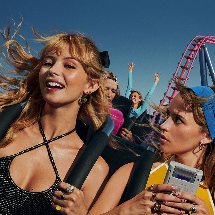
You would be hard pressed to come across an internet discussion about album covers where the image isn’t brought up in a positive light, immediately counteracted by the blunt remark that the music behind it almost never accompanies its mention. Truth be told, this is just an above-average pop record we’re talking about, at best (and quintessentially, if you’re a French speaker) an emotive, well-produced endeavor into more dynamic pop soundscapes for Angèle and, at worst, what many would dub “in-through-one-ear-out-through-the-other,” shopping mall or coffeeshop soundtrack. If the popularity of the cover has brought fresh eyes to the singer’s body of work, perhaps the latter isn’t strong enough to convert them to loyal ears.
Galway up-and-comers NewDad seem to be experiencing something analogous to that phenomenon regarding their 2024 debut LP MADRA and Joshua Gordon’s photo of a “haunted mannequin in a house full of sex dolls” — a porcelain doll sullenly staring downward with the nose and lips of her cracked yet preciously drawn face smashed off to reveal the gray material of her construction — which, out of the blue, managed to captivate Chinese internet before spreading across international corners. The striking “cracked mask” metaphor projected onto the pictured item has provided a mold that has lent itself to the creation of individualized artwork stemming from a range of fandoms with online residency. There is an indisputable charm to the image, its dead black background and starkly spotlit, morose subject, which is both feminine and haunting; an atmosphere interlaced with NewDad’s at times bleak and melancholic, but consistently graceful, poppy shoegaze.
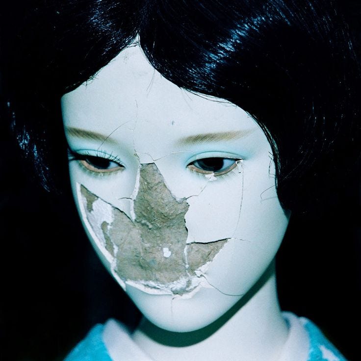
In the case of MADRA, one can very easily trace the common thread between visual and sonic elements, with the cover rendering the band’s debut album an intriguing introduction to their musical brand that not only contributes to myth, but is more definitive than any previous attempts at positioning their identity in their scene. Similar to how other visual parameters such as music videos or styling become key building blocks to an artist’s world and interfere with how their music is perceived by the public, album covers have a power of controlling the listener’s frame of mind wherein the music is to be consumed: the gateway to a record’s universe as a musician has constructed it and as they wish for it to be explored.
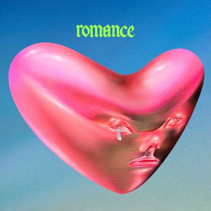
Reintroduction, in like manner, or more accurately, reinvention through a radical change in appearance was on fellow Irish post-punk experimentalists Fontaines D.C.’s minds for their latest era and record Romance where, according to frontman Grian Chatten, the band’s aesthetic shift towards bolder, androgynous fashion choices and neon accents was a means of making sure the album’s cinematic, dystopian inspirations were communicated effectively. Needless to say that Romance’s cover, a digital painting by Taiwanese artist Lulu Lin, takes the sentiment a step further. A picture of a bright pink, metallic heart whose sulky, humanesque face is adorned by a single, silver tear against a blue background, complete with the record’s title in the band’s signature font colored what resembles a “brat green” shade, the artwork neatly conveys both the industrial pivots in Fontaines’ sound and the project’s heightened emotionality, while naturally emphasizing the textural contrast there as the focal point.
Somewhere around those parts, I believe the true essence of a cover’s existence, as it has been contextually shaped through the years, is revealed: to act as a hand extended to the audience with the intention to usher them into a world, and a lens through which to both see and hear a body of work — a role the cover will end up assuming regardless of the level of earnestness or sarcasm it is imbued with.
American pop duo Magdalena Bay’s equally recent to Romance Imaginal Disk depicts in its artwork the literal start of the album’s sci-fi journey, with a portrait of vocal half Mica Tenenbaum, albeit posing as a fictional character, having a disk inserted into her skull by an alien hand. NYC-via-Seoul producer Yaeji’s 2023 With A Hammer had the artist posing, well, with a (really cute-faced) hammer, while South Korean rapper RM’s Indigo from the previous year carefully juxtaposed the titular blue hue against homely ivory and wood, offering an invitation to the record’s physical space with no ado.


On its one-year anniversary in September 2023, Rina Sawayama made the decision to reissue her album Hold The Girl with alternative art that “encapsulates [it] and all of its themes.” A slightly different interpretation of the title and a beautiful, figure-skimming, backless dress separated the second choice from the largely negatively received first, which pictured Sawayama in a black, globe-like garment indicative, according to her, of a metaphor of being pregnant with really personal material — though inevitably compared to certain bodily hygiene devices. There is a connection, here, to the pop woman-specific dichotomy of glamor shot versus anything else as discussed above with the premise of BRAT, however the records’ quality characteristics act dialectically. In Sawayama’s case, it’s fair to say that Hold The Girl’s sonic leanings enforce the more commercial option as the one that more accurately represents the actual work across its lustrous, bonafide pop structures that, although conceptually well-executed, lack (though not disappointingly so) the experimental edge the avant-garde artwork originally hinted at.


From Supertramp’s 9/11 “prediction” to Warhol’s iconic banana for The Velvet Underground and even to the circumstances that gave birth to the culture around album covers in the first place, context has perhaps historically generated the most analysis over collective perceptions of musical works and eras. The theme of hindsight comes up even when anchoring these musings to the present.
In the contemporary landscape and amid fans’ increasing meddling and critiquing when it comes to musicians’ output, covers have come to mean more than plain marketing pawns, becoming interwoven with artistic visions and symbolic of sentiments communicated via and beyond sound. Market forces aside, a lot of arrows point to the sheer significance of a visual element in music for which a cover, preceding videos and fashion, is a frontrunner: a way for the non-imagery-dependent medium of music to fill the gap of visual stimulation in an age that seems to demand it.
Thank you so much for reading. This piece has been long overdue, but I’m happy to finally be revisiting this series. All comments are welcome and much appreciated.

From "Deep Dive: Reflections on the Rise of NewJeans a Year after 'Attention.'":
Companies often put artists on pedestals the way a campaign would a model; a presentation that outright lets you know of their excellence and makes sure you want it for yourself. Such is a culture that struggles to show through when looking at Min’s input for visuals used in f(x)’s Electric Shock (2012) and Red Velvet’s Perfect Velvet (2017) album covers. Graphic designer and blogger hydekick writes on the latter: "This [...] trick collage seems less effective in terms of making use of idols’ facial appearance to the fullest extent. However, it turns out to be a good example of making a shivering atmosphere for this album."
All respect to graphic designers here, lest this bit is misunderstood. It's the company requests that trigger my curiosity.